前言
本篇為六角學院 flex 課程的筆記整理。
軸線的觀念
flex 運用的軸線的觀念來排版,其中又分為主軸與交錯軸,互相垂直。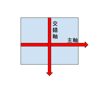
容器與元件
flex 分為外容器(container)與內元件(items),本篇著重於外容器的運用。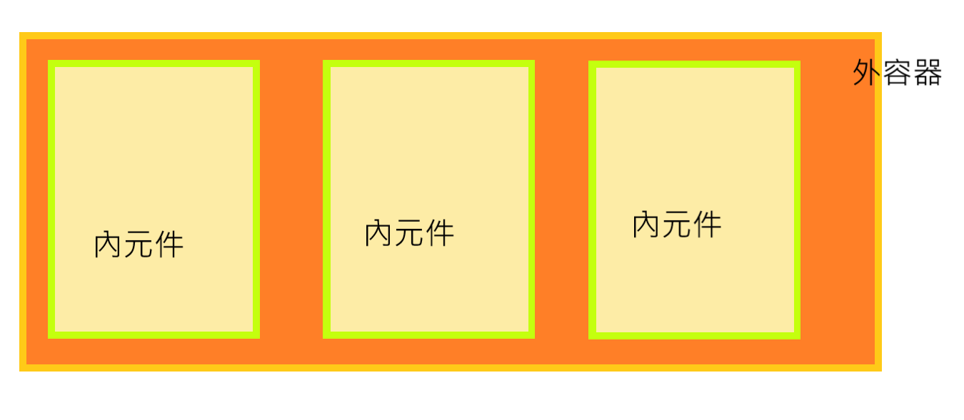
外容器的屬性
外容器用的屬性有以下幾種:
- display:一定要設定的屬性。
- flex-direction:決定 flex 的軸線。
- flex-wrap:決定換行的屬性。
- justify-content:主要軸線的對齊。
- align-items:交錯軸線的對齊。
flex 的特性
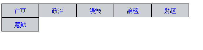
不管內元件的寬度設定多少都不會超出外容器,內部會依比例自己調整成適合的大小。
主軸的方向
使用 flex-direction 這個指令可以設定主軸的方向。
flex-direction: row
如果未設定的話會預設為 row,主軸方向由左至右。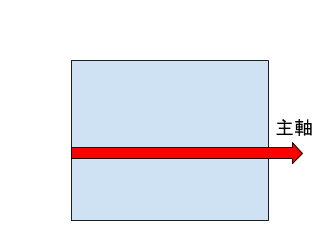
flex-direction: row-reverse
令主軸方向由右至左。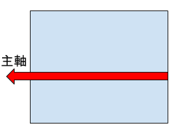
flex-direction: column
令主軸方向由上至下。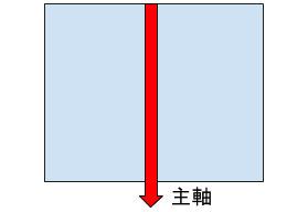
flex-direction: column-reverse
令主軸方向由下而上。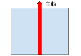
主軸的對齊
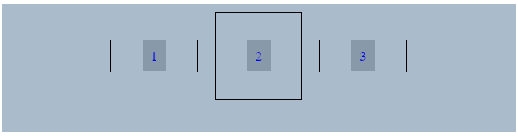
使用 justify-content 可以決定主軸的對齊方式,以下皆在主軸方向設定為 flex-direction: row 時的狀況。
justify-content: flex-start
如果未設定 justify-content 時會預設為 flex-start。
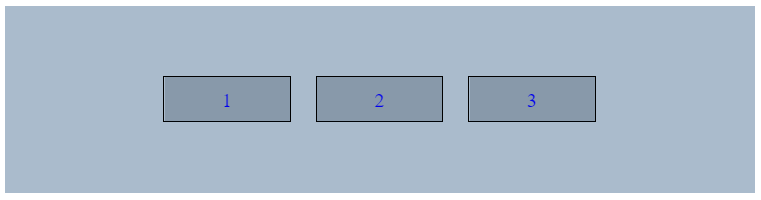
justify-content: center

justify-content: space-around
各元件會左右間隔相同。
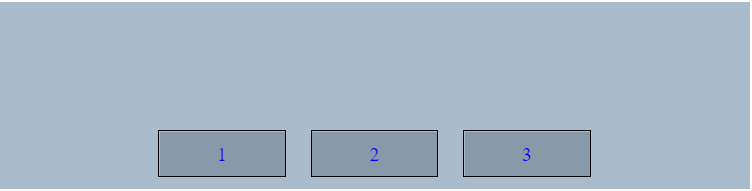
justify-content: flex-end

justify-content: space-between
會貼齊主軸起點及終點,並在各元件間適當間隔。
換行
利用 flex-wrap 來決定 container 滿的時候要不要自動換行,如果不設定換行會全部擠在同一行。
以下設定皆為 conatainer 寬度為 600px 以及 li 為 102px。
flex-wrap: nowrap
如果沒設定的 flex-wrap 的話會預設為 nowrap。
flex-wrap: wrap
交錯軸的對齊
交錯軸永遠與主軸垂直,一樣擁有起點及終點。
可以透過 align-items 來設定交錯軸的對齊方式,以下範例設定皆為 flex-direction:row、justify-content: center。
align-items: flex-start
如果未設定 align-items 的話會預設為 flex-start。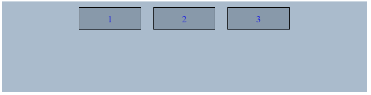
align-items: center
align-items: flex-end
align-items: stretch
align-items: stretch 會讓內元件與外容器等高,不過如果內元件有寫死高度的話就會無效。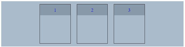
align-items: baseline